Incorporating My Passion for Food into My Future

A photo of an assortment of fruit and other food on a plate with a bottled drink to accompany it

With graduation six months away, my mind is being pulled in so many different directions of where I could see myself. On one end, I see myself living the glamorous city life in San Francisco. On the other end I see myself moving across the country to North Carolina living a humble life on the lake with extended family members.

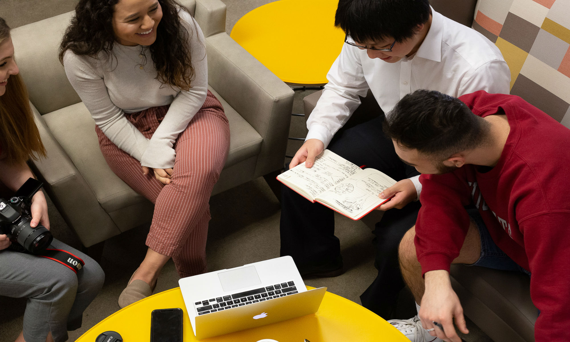
Both these situations are completely different, but I want to be immersed in something I am passionate about while utilizing the skills I learned in Tehama Group Communications.

I have been surrounded by cooking and baking my whole life. My dad has always had a passion for cooking. After his career as a golf pro ended he decided to start a catering business, Fuget About It Catering, out of our tiny suburban home kitchen.

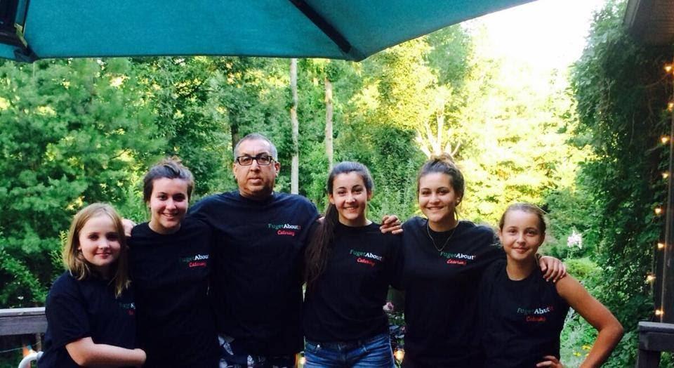
Since then it has developed into an incredible business that spread throughout our community by word of mouth. He now has a commercial kitchen and multiple catering jobs a day to prove his success. We started working for him right away as a way to make some quick cash but it soon turned into an amazing learning experience in the kitchen. Cooking is a means to express my creativity and come up with meals using ingredients I would have not thought would be good together.

So, how do I incorporate these passions into my future?

According to an article in Economy Watch, “the food industry comprises a complex network of activities pertaining to the supply, consumption, and catering of food products and services across the world.” This includes the marketing, distribution and advertising of products. That’s where I am most interested within the food industry.

Human’s basic needs will always include food and water therefore the food industry has nothing but room for growth and a profitable future. The food industry is a trillion dollar industry with is wide variety of networks.

O’Dwyer’s released a ranking of the top food and beverage public relations firms and amongst the top three are Edelman ($116,626,00),  Hunter PR ($16,500,000) and APCO Worldwide ($16,283,000). These are just three of a list of 48 agencies that work with the food and beverage industry. These growing numbers prove to me that I can work to incorporate my passion for food with my personal professional goals.

So, what’s next?

Network, network, network! That is the number one word I hear when I do site visits and it’s the way I plan to weasel my way into employers minds. I hope to stand out within these lucrative companies by incorporating my passion for food into my application process and researching their projects that involve food in some way.

Hopefully, in ten years when I am looking through old files I read this blog and have a smile on my face. The smile will be a result of incorporating my professional goals with my passions for cooking and baking.

By: Miranda Carpenello

The Art of Self-Editing

An open notebook with an empty page with a pencil and glasses on it, there is also a magnifying glass, camera and pottos all laid on a map

If you want your editor to love you, turn in clean copy. It is as simple as that. Not only will you win over your editor and they will possibly buy you lunch, but it makes both you and your editor’s lives easier.

Think about it.

The cleaner the copy you turn in as a writer, the less changes you have to make later on. It also allows your editor to turn your copy around quicker. This means you avoid a grumpy, sleep deprived editor at your Monday morning meetings. And everyone wins when the case of the “Mon-daze” is avoided.

So, here are my five tips on how to write clean copy and earn a free lunch from your beloved editor:

  1. Take a Step Back
    After you have finished a new piece of writing, leave it for a few hours before making your first round of edits. This allows you to become unfamiliar with your piece allowing you to read it objectively.
  2. Read Your Writing Forward, Backward and Sideways
    Read your writing over and over again. You obviously can’t read your work sideways but reading it backward disrupts the narrative flow, which helps you catch mistakes you’d normally skim over. Read your writing starting with the last paragraph, working back up to the beginning.
  3. Read it Out LoudScream it if you want but just make sure to not get a noise complaint. Reading your work out loud allows you to keep your brain from automatically correcting mistakes.
  4. Have a Colleague Look it OverThe more eyes on a piece before it reaches your editor, the better. If you have people willing to read your work, take them up on it. There is a good chance that they will catch mistakes that you have been subconsciously skimming over.
  5. PENCIL TAP
    Take the tip of that writing utensil that is going out of style and tap on every single word. This helps slow your brain down so you don’t fill in the blanks when you edit your work. It makes your brain focus on each individual word rather than your brain trying to predict the rest of the sentence. If you follow these five tips, you will be enjoying your favorite pizza place or preferred coffee joint in no time. And all of it will be at the expense of a happy editor.Written by: Dylan Wakefield 

How to Be An Inclusive Writer

As an aspiring public relations professional, words are a big part of my job. From press releases to Instagram posts, my words matter and they affect a lot of people. That being said, here is a resource guide for being an inclusive writer:

Race: When we, as professionals, are writing for a diverse audience, we are first representing our clients, first and ourselves, second. We must take into account that our audiences are diverse and may not have experienced the world from our vantage point. We do not want to offend our readers, plus, we have our clients’ reputation on the line with every keyboard click. Research always needs to be done when writing about race. Here are four different resources in regards to writing about race. These resources provide you the opportunity to break out of your bubble and be a more conscientious and inclusive writer.

Gender and Sexuality: Gendered language haunts the English language. We use gendered language everyday. It is ingrained in us to say, “policeman or mailman.” Sometimes, it is hard to identify gender-neutral terms for words that we say everyday without a second thought. One way to work in gender neutral terms into your everyday language is by using the singular they/them pronouns. If you are addressing someone and don’t want to assume their pronouns, a good rule of thumb is to use they/them. I have provided a resource along with other links below:

Ability/Disability: Often, means of ability are glossed over by media or negatively portrayed to emit a sense of shame. Instead you could use, “people with different abilities.” Avoiding stigmas around abilities will not only make your writing more inclusive, it can help empower people. Here are some resources to consider when writing about people with different abilities:

As professionals in a fast-paced environment, research before writing is KEY.

Being able to write in an inclusive manner can make your audience feel welcome and safe. It will create a sense of trust and transparency around your company and that can greatly improve its relationship with the public. When a marginalized community can see you took the time to include them, you raise the standards for  companies around you.

As professionals dedicated to the ties between company and community, you CAN do better to be more inclusive. My hope is that this resource guide can be used as a stepping stone to successful inclusive writing.

Other related writing style guides:

5 Ways to Stay Out of Trouble on Social Media

You know this scenario all too well.

You are scrolling through your camera roll on Sunday morning and find photos from last night of you with your roommates at the bars. You think you have found a photo that is totally insta-worthy. That is when you should stop, drop and ask yourself, “Is this acceptable to post on social media?” Here are some guidelines to consider.

  • Don’t post anything you wouldn’t want your future employer to see.

You are sadly mistaken if you think employers read your application and resume and leave it at that. Social media is not a full representation of who a person is. However, when employers are sifting through hundreds of applications, it is something that puts a face and personality to your application. Make sure you take advantage of your online persona and craft it into someone that people will be pining to hire. Or, risk employers moving on to the next applicant because your online image is unprofessional and sloppy.

  • Privacy online is a myth.

You might think you are safe if you have your accounts on private, but there is always a mutual friend who can show someone of importance your posts on social media. Screenshots exist. You should assume the worst when posting something risky on social media, whether it is a photo on Instagram or a tweet.

  • Keep it neutral.

It should go without saying, but you should not post vulgar language or insensitive viewpoints on social media. You are entitled to your opinions. Just be ready to own up to the consequences for posting politically heated views or language that you wouldn’t want your grandmother to hear you say.

  • If you hate your job, complain to your friends in person. Don’t blast it on social media.

First of all, your current employer could see it and fire you. You might not care about it at the time, but think about how it could affect you when you are looking for a new, better job. If other employers see you complaining freely and publicly, they might not think you are the right person for their company. Who is to say you won’t start bad mouthing them once you get the job?

  • Showcase your personality.

Professional social media profiles shouldn’t lack personality. Just because you are refraining from posting unprofessional content doesn’t mean you shouldn’t share photos from your life or let your humor seep into your captions. Your social channels should leave a good first impression. Keep them clean, but make sure to make them interesting. Most importantly, make them reflect who you are and what you stand for.

Written by: Victoria Agius

Avoid Typographic Disaster – A Guide to Use Typography And Organize Presentations


As we all probably know now, the 2017 Academy Awards had the biggest screw-up in its 88-year history. When Warren Beatty and Faye Dunaway announced the nominee for the wrong category of award, they were just as confused as we were. They were given the Best Actress envelope when they were supposed to announce for the Best Picture. What is the cause of this disaster? ­

Typography.

On the nominating card, very small fonts are used on the award name and large bolded fonts are used on the nominee’s name. Warren could not read the it and a typographic disaster is created.

Typography is a study in process of making typefaces. Typeface is often called “font,” but this is a common misconception. A typeface is a series of fonts that make a font family. Font is just one character style that belongs to a typeface. Within the typeface, there are fonts with various weights and styles. Understanding what typeface, you are using and how to use them can enhance the attractiveness of your presentation.

I will guide you through what I have found about using typefaces in a presentation.


  1. Legibility

Legibility means being clear enough to read. It is an important aspect in using typography. This is most likely the first thing that you learned when you just start to write in elementary school. All alphabets have its specific written style. If we use a typeface that has too much decorative parts in a presentation (like a script typeface), it might create reading problems for your audience. Avoiding script and decorative typefaces can make your presentation look clean and easy to read for your audience.


  1. Using matching typefaces

Typefaces are designed to be used in various places, like paper documents, websites and presentations, but different typefaces can also work together to make your message clear in a presentation. A serif typeface like Times New Roman is normally good for smaller text but it would not work well for a title or heading because its long serif can be distractive. San serif typefaces like Helvetica are great for large texts but would look boring for smaller text. Sometimes you can mix and match serif and san serif typeface in one slide of a presentation.


  1. Focusing on function rather than form

When it comes to what typeface to choose, we often try to choose more complicated typefaces with unique forms. It might be interesting for a slide but most of time it only makes your audience more confused. A better way to find what typeface to use is to understand your content. For example, if you are doing a slide related to history, serif typeface can fit to the theme very well.  Try not to use typefaces that have complicated visual effects. If you really want visual effect, take a consideration of the legibility of that typeface.


  1. Over emphasizing

Sometimes we tend to emphasize too much on one point of a slideshow. Instead of a short phrase, people tend to write a crowded paragraph, which reduces readability of a slide. It causes people to squint their eyes and lose focus on the speaker. It doesn’t mean we shouldn’t emphasize anything. Sometimes certain content requires different level of emphasis.


  1. Creating hierarchy

Spending time on prioritize what is important content can help you categorize your points. Then lay out what is most important from secondary important. This also helps us to figure out how many words you will have on your slide. The goal is to eliminate unnecessary words and make the presentation cleaner.

At the end of the day, your presentation has to be simple and clear. The purpose of having a demonstrative piece is to help others to understand and organize knowledge. If a slideshow confuses people, it will defeat the purpose of having a slide show altogether. 2017 Academy Awards could be a lot more successful if the card designer of the event care about typography and organization in any form of visual communication.

How to Perfect Your Instagram Brand

How to Perfect Your Instagram Brand

Instagram is an incredibly important part of maintaining a successful and modern business. I mean, look at Starbucks and their 14 million Instagram followers– that’s the same amount as Channing Tatum! Starbucks doesn’t post selfies of their six-pack so they must be doing something else right. So what exactly is it that makes a successful Instagram page and attracts followers who are genuinely interested in the products or services you are selling?

Color

First and foremost, there are 600 million monthly active Instagram users so it is important to make yours stand out on the very first click. One way to do this is by choosing a curated color palette. Take Youtuber Rachel Aust’s Instagram, for example. She sticks to four primary colors: white, black, green and light pink. This has become her brand and it is quite successful. I automatically know that it is one of her posts the second it pops up in my feed. Businesses can use this tactic by making their logo colors the primary colors in their posts.

Another way to curate your Instagram’s color palette is by sticking to a consistent filter. I personally use an app called VSCO and stick to one or two filters. Another way to do this is to use Photoshop to edit out colors that do not work with your theme. This may seem like a lot of work but having a well-thought-out Instagram will attract customers and make your business more money—which, when put in those terms, is worth a few minutes on Photoshop.

Don’t forget to keep up with the latest trends in your field for color but also try to stand out and be unique. People will remember a unique color scheme and come back looking for more.

Quality over Quantity

Alright, now that your aesthetics are on point, quality photos are a must. Even though the iPhone 7 can take better photos than some point-and-shoots, most professional businesses will use only high quality DSLR photos for their Instagram. This can include shots of models wearing a company’s clothing line, photos of the city the business is located in, inspirational quotes on top of beautiful backgrounds and more. World Market does a great job curating their Instagram because they pair high-quality photos with a consistent color scheme.

If you are lacking content for your Instagram feed, simply go outside and take photos of the city for an hour and use this shoot throughout your feed to promote variety and also personalize your business. For example, if you are trying to sell sandals, good content would include photos of the beach–the perfect place to wear your sandals.

Give Your Brand A Voice

Yes, it is great to sound professional and get right to the point, but people relate to real-life stories and humor. Caption the photos with a voice that is unique to your brand. Don’t be afraid to be hilarious or respond to comments. But, be wary of controversial issues if you do not want to lose customers or followers. A dramatic example of personalized brand voice comes from Denny’s, who makes it a point to post hilarious photos with equally compelling captions.

Plan It Out

A strong Instagram brand has variety so say hello to color-coded spreadsheets! Create your brand using an Instagram content calendar. This is a great way to make sure that you are not forgetting to make content for key social media holidays. Um, hello! Are you even a reliable Instagram business if you forget about National Donut Day? Although content calendars are great to hit key points, there are apps for more visual thinkers. For example, SneakPeek is an app that allows one to plan their Instagram feed in advance and see what works and what needs to be updated.

The Wrap Up

Of course, the most important part of an Instagram brand is staying authentic to the business and what is being sold. You are selling to humans who are not only attracted to what’s beautiful, but also to what’s real. We hope you found this helpful! Comment and let us know if you have any other tips and tricks up your sleeve for curating the perfect Instagram feed.


5 Tips On How To Snap The Best Pic

In photography composition is key. Placing your subject, using certain colors, and picking the right background helps your picture look the most professional it can be. The subject of your photo is the most important part to make clear and draw the audience’s attention to. Because the subject is the reason you are taking the picture, it should clearly be in focus. Here are some tips on how to lead your audience’s eye to the subject and make your picture stand out among the rest.

Tip # 1
Leading Lines: Use lines to lead to your subject, a specific part of the frame, or a vanishing point in the background of the frame. People’s eyes naturally like to follow lines.

Tip # 2
Rule of thirds: Divide your frame into two horizontal lines and two vertical lines equally. The important elements in your picture should be placed along one of those lines instead of in the center of the picture. An off-center picture is more pleasing to the eye.

Tip # 3
Complementary colors: Every color has an opposite on the color wheel that compliments it the best and has the strongest contrast when put next to each other. Use colors that compliment each other and make the other color stand out. For example, red is the complementary color and opposite of green.

Tip # 4
Framing: When placing your subject in a photo, proper framing can really make your subject stand out. Using structures, windows, door frames, light etc. to crop around your subject work well to guide the viewer’s eye toward the subject.

Tip # 5
Rule of Odds: Always use an odd number of subjects when working with more than one subject. This gives the picture more harmony and balance visually.

Your composition can make or break your photo,so next time you are about to snap a picture keep these compositional tips in mind. Play around with these tips and watch your photography skills grow! Happy snapping!


Collaborating with other designers

As graphic designers, it seems to be common place for us to find ourselves trapped inside of our own creative bubble, ignorant to the outside creative world that surrounds us. The problem here is when we don’t allow that bubble to pop, any good design or aesthetic inside of it will be trapped forever and never have the chance to grow. It is with the collaboration of other designers that our ideas begin to take a more compelling approach.

Each designer has their own mastered skill set unique to that individual. The key to design is understanding that there are areas of your work that still have room to grow. When working with other designers, it can be helpful to begin with a simple conversation. You might discuss strengths, weaknesses, inspiration, motivation or even how your Saturday night was! Whatever it may be, open a dialogue, and become familiar.

Don’t be afraid to tell someone if you do or don’t like their work. The best criticisms often pair a pro with a con–what is working and what isn’t. It is crucial to always be open and honest with your colleague designer–nobody wants to hear filtered thoughts about their design concept. Analyze and consider their direction, and then speak up and have a conversation about it. This is where the collaboration is able to take full effect: opening a dialogue and discussing each other’s work without directly comparing one to the other.

The best lessons you’ll learn will come from your collaborative efforts and conversations with other designers. Stay confident and happy designing!

Written by Cole Euell

How to avoid overdesign


An important skill for designers besides HOW to design is to know when to STOP designing. Everyone gets caught up in their project at hand wanting to have the perfect outcome and before you know it, your design can start to look like you will be the only person to understand its purpose. Learning not to over design takes practice and communication. The happy medium of design comes with experience throughout your design career. “Less is more” rings true throughout the design world and should be a phrase that hangs over every designer’s head. Trying to incorporate too many ideas or design elements can leave you with a cluttered design that has lost its initial function. It can be easy to overdesign without even knowing you’re doing it. There are many tips and tricks of the trade to help designers become aware of overdesigning before their concepts crash and burn. Here are a few to keep in mind:

5 TIPS TO AVOID OVERDESIGN

  •  Have a plan & don’t second-guess yourself

Know exactly how much time you have to get a project done. Having a clear plan of action can help the function of your design. It can be easy to second-guess yourself, especially if it is a new project or new client you are designing for. Remember to always go back to your proposal brief and review exactly what your client is asking for. If you come to the conclusion that YES! your design is achieving what the client wants, send it off and wait for feedback.

  • Enlist a second set of eyes

Take a step back and take a break. When you have been consistently staring at a project and tirelessly working, it is nice to have someone else take a look. They might spot something you missed or give you constructive feedback. You as a designer can also be your own second set of eyes if you pull yourself out of the design process for a period of time and return to your design with a fresh mind. You will probably find yourself eliminating aspects rather than adding more.

  •  Consider each elements purpose

After taking a step back from your design it can be helpful to take some time and consider each element’s purpose. Does that color palette represent the brand? Do those lines actually break up the content? It is important to consider the purpose of each element in your design since if you can not justify its purpose it may be necessary to hit that delete button.

  • Create more than one version

Options, options, options. Whether it is a logo, web graphic or poster, more than one option can ensure a good outcome. Having multiple versions is very important when it comes to client work! It is better to see what elements work and what better way to visually notice in two designs than cramming every idea into one design. Trust me, it will not look cohesive. Your vision will come across cleaner from two versions than one cluttered one.

  • Always keep your goal in mind Know your audience and the purpose of the design.

Written by Erin Riley

A Quick Guide to Shooting Travel Photography


Nevada Night Sky
Long Exposure of the Nevada night sky

People go on vacation and take pictures. It’s what you do. It’s simply what vacationers do when they travel to exotic, never before seen places. Photography is an amazing phenomenon that we take for granted in the 21st century. The way we are able to harness a memory by simply capturing a blend of light and color with a machine is truly amazing.

However, there are instances when this miracle of capturing light, falls short of our desires and expectations. Follow me on a short magic carpet ride through some tips that I have gathered in my travels around the world.

Budapest Bath House
Sunset over Budapest Bath House on Christmas Eve.

Traveling and shooting photos go hand in hand. Not only does it compliment your Hawaiian shirt and fanny pack, but it immediately pegs you as a tourist.

No. 1, accept the fact that you’re a tourist and embrace it with grace and intelligence. If someone throws you a skeptical eye, keep snapping on, but be smart and hold yourself with a certain level of discretion. You’re not going to buy the traditional garments of every nation to blend in, so you might as well avoid the headache trying enjoy documenting your experience. However there are some exceptions, which leads me to tip No. 2.

Israel Soldier
Tay Dayborg from Israel, at Mount Herzl, Jerusalem

This point segues to my next tip. It’s a simple one. Several years ago, I was on the beautiful island of Sicily, Italy taking photos around a rustic, dust filled neighborhood. On the corner were two men drinking coffee. Not thinking anything bad of the calm situation. I snapped a quick photo of one of the men who happened to be looking my way just as I took the photo. Instantly he got up and walked toward me. A bit startled, I quickly erased the photo before he arrived. When he approached me I saw he was holding out his hand, he wanted money for the photo. I explained that it was gone and that he had nothing to fear. Nonetheless, he watched me intently as I scrolled through every single photo I had on the camera. Tip No. 3, if you get caught taking a photo of someone you shouldn’t be, erase it or give the subject of the photograph what they want in order for them to be happy.

Tip No. 4, pay attention to your surroundings. Look everywhere from every angle, you never know what could be waiting for you in the distance just a few feet away you. Timing is crucial. A moment in time is lost forever if you are not actively looking for it. This goes for foreground and background as well. Understand the dynamics of your depth of field and move to the best spot within your environment. By positioning yourself at just the right place, you can truly have your picture follow speak a thousand words.

Abhi Sarkar
Abhi Sarkar from Santa Barbara, at Moab National Park.

Tip No. 5, call a friend’s name at the right moment for a dynamic candid. People look their best when they are doing something that they love or truly inspires someone. See your friend staring out over a beautiful landscape? Get your camera ready, call their name and snap the photo before they realize what just happened. I find that catching people with their guard down produces some of the most engaging photos. Often, people lost in thought seem to stare right into the camera with such intensity that I feel as though they can see my very soul. The feeling is contagious, yet hard to pull off consistently. Keep practicing, who knows what you will find within the eyes of someone you thought you knew.

Marian Amira
Marian Amira Jonjo hailing from London, England, “caught” at the Marin Headlands.

When traveling, be respectful and mindful of where you are to the best of your ability. Enjoy your privilege as a photographer; heft that clunky camera around with pride. Use this machine wisely, knowing that not everyone can have the same opportunity as you to document the beauty of life. Keep on snappin’.

*All photos taken by Trevor Raven Foster, All rights reserved*

Written by Trevor Foster, Videographer/Photographer