The Creative Process

Things to keep in mind – Videography

Videography requires a lengthy process which involves a lot more than just picking up a camera and recording. It’s important to make time for the creative and collaborative process. The more time you spend working through and agreeing upon an objective, the less time it will take you to reach your goal and have a successful outcome. Take more time during this process to fully develop a clear concept.

The first thing you will realize when it comes to the creative process, is that it involves an extraordinary amount of patience. The pre-production process is a slow process. You have to carefully plan out where you’re going to shoot, who or what you’re going to shoot, the lighting, the audio, and many other things. These all take time to plan out and you might want to move more hastily but you have to remember that, “good things take time”.  It’s better to film your production with careful planning and have it be successful. As opposed to rushing it and having to go back and re-do things due to mess-ups or difficulties. It might be a slow process but  try to enjoy it and just know that it will pay off when it’s all said and done!

Sometimes, your client or boss may not exactly know what they want. During these times, you will have to step up and take charge. Many of the decisions made during pre-production, film creation, and post-production will be influenced by your vision and voice. Don’t be afraid to speak up if you have an idea that you believe will better capture the image or deliver the message. However, you need to remember that you are trying to create their vision. So be respectful and try your best to guide them through your creative process so that you can work well together. It’s important to balance your process with what the client needs. Keep your goals in mind but also make sure that you reach your client’s goals as well.

Be confident! Get over your fear of being judged or being wrong. We all start being creative from a young age and often times, others tend to discourage us. You’ve experienced this during your time in school and even out of school. You won’t always be able to get everyone to like your idea or to agree with you. However, it’s important to be confident in yourself and your work. Confidence and a positive attitude can go a long way.

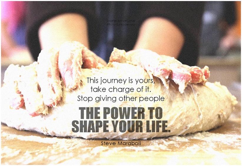
Just remember to work hard and have fun! You have the power to create a piece that not only meets your client’s needs, but that also satisfy yours.

Written by; Braulio Martin

5 Ways to Stay Out of Trouble on Social Media

You know this scenario all too well.

You are scrolling through your camera roll on Sunday morning and find photos from last night of you with your roommates at the bars. You think you have found a photo that is totally insta-worthy. That is when you should stop, drop and ask yourself, “Is this acceptable to post on social media?” Here are some guidelines to consider.

  • Don’t post anything you wouldn’t want your future employer to see.

You are sadly mistaken if you think employers read your application and resume and leave it at that. Social media is not a full representation of who a person is. However, when employers are sifting through hundreds of applications, it is something that puts a face and personality to your application. Make sure you take advantage of your online persona and craft it into someone that people will be pining to hire. Or, risk employers moving on to the next applicant because your online image is unprofessional and sloppy.

  • Privacy online is a myth.

You might think you are safe if you have your accounts on private, but there is always a mutual friend who can show someone of importance your posts on social media. Screenshots exist. You should assume the worst when posting something risky on social media, whether it is a photo on Instagram or a tweet.

  • Keep it neutral.

It should go without saying, but you should not post vulgar language or insensitive viewpoints on social media. You are entitled to your opinions. Just be ready to own up to the consequences for posting politically heated views or language that you wouldn’t want your grandmother to hear you say.

  • If you hate your job, complain to your friends in person. Don’t blast it on social media.

First of all, your current employer could see it and fire you. You might not care about it at the time, but think about how it could affect you when you are looking for a new, better job. If other employers see you complaining freely and publicly, they might not think you are the right person for their company. Who is to say you won’t start bad mouthing them once you get the job?

  • Showcase your personality.

Professional social media profiles shouldn’t lack personality. Just because you are refraining from posting unprofessional content doesn’t mean you shouldn’t share photos from your life or let your humor seep into your captions. Your social channels should leave a good first impression. Keep them clean, but make sure to make them interesting. Most importantly, make them reflect who you are and what you stand for.

Written by: Victoria Agius

Avoid Typographic Disaster – A Guide to Use Typography And Organize Presentations


As we all probably know now, the 2017 Academy Awards had the biggest screw-up in its 88-year history. When Warren Beatty and Faye Dunaway announced the nominee for the wrong category of award, they were just as confused as we were. They were given the Best Actress envelope when they were supposed to announce for the Best Picture. What is the cause of this disaster? ­

Typography.

On the nominating card, very small fonts are used on the award name and large bolded fonts are used on the nominee’s name. Warren could not read the it and a typographic disaster is created.

Typography is a study in process of making typefaces. Typeface is often called “font,” but this is a common misconception. A typeface is a series of fonts that make a font family. Font is just one character style that belongs to a typeface. Within the typeface, there are fonts with various weights and styles. Understanding what typeface, you are using and how to use them can enhance the attractiveness of your presentation.

I will guide you through what I have found about using typefaces in a presentation.


  1. Legibility

Legibility means being clear enough to read. It is an important aspect in using typography. This is most likely the first thing that you learned when you just start to write in elementary school. All alphabets have its specific written style. If we use a typeface that has too much decorative parts in a presentation (like a script typeface), it might create reading problems for your audience. Avoiding script and decorative typefaces can make your presentation look clean and easy to read for your audience.


  1. Using matching typefaces

Typefaces are designed to be used in various places, like paper documents, websites and presentations, but different typefaces can also work together to make your message clear in a presentation. A serif typeface like Times New Roman is normally good for smaller text but it would not work well for a title or heading because its long serif can be distractive. San serif typefaces like Helvetica are great for large texts but would look boring for smaller text. Sometimes you can mix and match serif and san serif typeface in one slide of a presentation.


  1. Focusing on function rather than form

When it comes to what typeface to choose, we often try to choose more complicated typefaces with unique forms. It might be interesting for a slide but most of time it only makes your audience more confused. A better way to find what typeface to use is to understand your content. For example, if you are doing a slide related to history, serif typeface can fit to the theme very well.  Try not to use typefaces that have complicated visual effects. If you really want visual effect, take a consideration of the legibility of that typeface.


  1. Over emphasizing

Sometimes we tend to emphasize too much on one point of a slideshow. Instead of a short phrase, people tend to write a crowded paragraph, which reduces readability of a slide. It causes people to squint their eyes and lose focus on the speaker. It doesn’t mean we shouldn’t emphasize anything. Sometimes certain content requires different level of emphasis.


  1. Creating hierarchy

Spending time on prioritize what is important content can help you categorize your points. Then lay out what is most important from secondary important. This also helps us to figure out how many words you will have on your slide. The goal is to eliminate unnecessary words and make the presentation cleaner.

At the end of the day, your presentation has to be simple and clear. The purpose of having a demonstrative piece is to help others to understand and organize knowledge. If a slideshow confuses people, it will defeat the purpose of having a slide show altogether. 2017 Academy Awards could be a lot more successful if the card designer of the event care about typography and organization in any form of visual communication.

5 Tips On How To Snap The Best Pic

In photography composition is key. Placing your subject, using certain colors, and picking the right background helps your picture look the most professional it can be. The subject of your photo is the most important part to make clear and draw the audience’s attention to. Because the subject is the reason you are taking the picture, it should clearly be in focus. Here are some tips on how to lead your audience’s eye to the subject and make your picture stand out among the rest.

Tip # 1
Leading Lines: Use lines to lead to your subject, a specific part of the frame, or a vanishing point in the background of the frame. People’s eyes naturally like to follow lines.

Tip # 2
Rule of thirds: Divide your frame into two horizontal lines and two vertical lines equally. The important elements in your picture should be placed along one of those lines instead of in the center of the picture. An off-center picture is more pleasing to the eye.

Tip # 3
Complementary colors: Every color has an opposite on the color wheel that compliments it the best and has the strongest contrast when put next to each other. Use colors that compliment each other and make the other color stand out. For example, red is the complementary color and opposite of green.

Tip # 4
Framing: When placing your subject in a photo, proper framing can really make your subject stand out. Using structures, windows, door frames, light etc. to crop around your subject work well to guide the viewer’s eye toward the subject.

Tip # 5
Rule of Odds: Always use an odd number of subjects when working with more than one subject. This gives the picture more harmony and balance visually.

Your composition can make or break your photo,so next time you are about to snap a picture keep these compositional tips in mind. Play around with these tips and watch your photography skills grow! Happy snapping!


Tattoos In The Workplace

Tattoos or “taboos,” depending how you view them, have always been a hot topic of conversation when it comes to the workplace. Questions of their professionalism and whether they belong in the workplace are constantly circling.

I think tattoos are beneficial to the workplace for these reasons:

  •     Tackle social norms and challenge the changing industry of public relations.
  •      Address a social change that is congruent with the shift in generations.
  •      Teach people to not judge a person by their appearance.
  •      Teases people to ask questions and engage with their coworkers.
  •     Offer another perspective.
  •     Open a door to imagination and interpretation from others
  •      Shows creativity and expression.

Shaming the presence of tattoos in the workplace stifles the creativity and expression of employees in an industry that needs those qualities.

Now more than ever, public relations firms need inventive individuals in order to make an impact in the growing industry. I think ownership of tattoos demonstrates  risk taking ability, and that can translate to a positive work environment.

I have two tattoos, one of which rests on my left forearm just below my elbow bone. It consists of three evenly spaced, black lines that represent my two siblings and me. All three of us got the tattoo together but in different regions of our bodies, and mine got the most flack from our parents because my location is the most prominent of the three.

Prior to getting this tattoo, my parents felt the need to reinforce the idea of damaging my future chances at getting a job. I was conscious of the severity of my decision and that I could potentially be limiting myself of future jobs but I decided that I would never want to work for a company that stumps creativity in the workplace by not allowing tattoos. I also figured that most professional attire would cover my tattoos, but there was still risk involved.

Just like most anything else, there is a time and a place for tattoos as well. At the end of the day, companies have to protect the workplace, so not all tattoos may be acceptable depending on whether they contain vulgar or offensive content. But more importantly than vulgar tattoos, I think tattoos should be covered when meeting with a new client for the first time. With varying opinions on tattoos it is always best to err on the side of caution when you are trying to make a great first impression. No one wants to damage a relationship or lose a client because of something that could have easily been avoided.

As a send off tip, I think a good rule of thumb to follow is the saying, “In the streets dress your best but at work be comfy at your desk.” Simply, just cover up your tattoos if you could be client facing.

Each Chainsmokers Song Sounds ‘Closer’ To The Last

Why do we love to hate The Chainsmokers, or hate to love them? It’s a constant battle between the two, but we still can’t stop listening.

The Chainsmokers are an American DJ duo consisting of Drew Taggart and Alex Pall. They formed in 2012, but Pall wasn’t in the group yet. At that time, it was Taggart and another producer named Rhett Bixler.  

The Chainsmokers may not know this, but they are successful public relations professionals. PR often entails social media and press releases; however, this DJ duo uses their music equation as their own personal form of PR.

A commonly heard complaint about these artists is that all of their songs sound the same.

Here’s the catch–they do that on purpose. Let’s dive deeper.

The Chainsmokers’ first ever live performance and popularity breakthrough was with their ever-so-trendy (and ever-so-hated-on) single, #Selfie, released in 2013. #Selfie reached top hit charts internationally. The beat is catchy and words are fun to mock, think: Friday.

From this point forward, The Chainsmokers’ hits have gotten increasingly popular. The most crowd-pleasing include: Closer, Don’t Let Me Down, Something Just Like This and Paris.

Although the most popularly used beats per minute for top hits is 120 BPM, all of these tracks are within a slower range of 80-100 BPM. The Chainsmokers chose a beat that matches our resting heart rates, making the songs easy to listen to.

We sing along with the vocals effortlessly. This is because they commonly consist of a small variation of notes that are within our mid-range, or natural speaking pitch.

The lyrics are simple and to-the-point with minimal need for imagination. We don’t need to wonder what he means when he says, “Baby pull me closer in the back seat of your Rover.” The picture is crystal clear. Our brains fully grasp what is going on in the song; we learn the lyrics quickly.

Lastly, The Chainsmokers follow something called a simple verse-chorus form. The verses and choruses use the same tempo and notes. This makes the songs satisfying and pleasing to the ear. By the time the drop comes, you’ve already heard those notes- in that order. But this time, it’s just done with a synthesizer instead of vocals. Our brains love patterns, and we can hear them time and time again in The Chainsmokers’ music.

By combining a soothing beat, simple melodies that are easy to sing and a satisfying song form, The Chainsmokers have roped us in without us even realizing.

As musicians or PR professionals, it is important to take note of the tactics The Chainsmokers use to ensure their optimum success. By using their crafted equation, they are able to keep listeners tuned in.

Are The Chainsmokers musical sellouts or simply clever public relations practitioners? That’s up to you to decide.

Pinterest Projects Made Easy


Find yourself spending countless hours on Pinterest, pinning crafts that you wish you had to decorate your house with? Well here are a few simple crafts that don’t take much effort or money!

Crafting is a great way to use your free time because it keeps you busy and you end up with great decorative accents for your house or apartment!

Check out my video on how to start crafting!

How-to! Fall Pumpkin & Floral Centerpiece

The upcoming holiday season is a time to reflect on all that you’re thankful for while spending time with loved ones. It’s also a time when many people will be entering your home to celebrate, so you might as well add some glamour and personality with themed decorations.

In this video I will be teaching you how to create a beautiful pumpkin and floral centerpiece. Display it in your home or give as a gift!

Supplies needed:
• Medium sized hollow pumpkin
• Medium sized vase
• Fall-colored spray paint of your choice
• Clear finishing spray paint
• Black acrylic paint
• Thin paintbrush
• Pencil
• Sharpie
• X-Acto knife
• Fresh flowers

How-to! Fall Pumpkin & Floral Centerpiece from Raquel Borrayo on Vimeo.

A Creative Do-It-Yourself Project for the Holidays

By Lindsay Smith, Graphic Designer
The holidays are coming up and gift giving is on the mind. What a great time to bust out your creative juices and attempt a few DIY projects. I have made a step-by-step video showing one of the art projects I attempted. I hope this will inspire you all to save some cash and be creative this holiday season.