Gridley Grid Generator – Custom CSS grids for your next web design project


Screen shot 2015-03-24 at 12.01.09 PMImage courtesy of Wikipedia

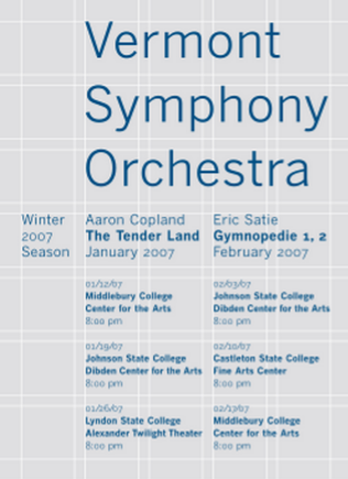
As a graphic designer I’m often presented with large sets of information that I need to format in an attractive, easy-to-read fashion. To accomplish this I often make use of a grid system. Grids break up the page into multiple sections through the use of evenly spaced, vertical lines.

With the rapid development of web technologies, we can now use grid systems in website designs that use CSS, the formatting language of the web. There are a number of different CSS grid systems that can be found with a quick Google search, but if they don’t match your needs then you need to make one yourself. The process isn’t too complicated, but it takes time and involves a lot of arithmetic that a computer could be doing for you.

I created the Gridley Grid Generator so that you can quickly generate customized CSS grids to fit your needs. Even better, by setting the units field to ‘%’ you can create a responsive grid system that will shrink and grow to fit the user’s screen size.

Need help using your new grid system? Visit www.mildwestdesigns.com/gridley/help.html for more information.

Find this useful? Check out my CSS Drop-down tutorial

By Paul Hebert, graphic designer

A Designer’s Perspective

As a graphic designer, I am constantly taking note of the designs I encounter everyday. Most people are drawn to what they perceive as good design, but as a designer I look for good typography and more technical aspects of design.

Books
I have always judged a book by its cover. The cover or the spine is what draws me to pick a particular book off the shelf. A well-designed cover can reflect the effort that was put into the content of the book. As an avid reader, I have discovered that this is most often the case. Each year Design Observer holds 50 Books 50 Covers, a design competition that honors the year’s best book designs.

Restaurants
Restaurants are full of design. When I am pursuing the menu I can’t help but notice the typography. A well-designed menu is much easier to follow whether you are a designer or not. In a restaurant, the visual presentation of the dish can be just as important as the atmosphere that is created by the branding. Recently, I went to a restaurant with a family member and was greeted by the dreaded comic sans displaying their hours on the door.

Presentation
Recently, I was sitting through a series of PowerPoint presentations in a marking class fighting the urge to take over the computer and change the font to something other than Arial. I was relieved when the fourth group had chosen to use Garamond. The way information is presented can have a great effect on how well the information is absorbed. Good visuals make information easier to absorb, a fact that Duarte, a presentation design company knows well. Their work takes presentation design to a new level.

A World Through Rose-Colored Glasses

By Lindsay Smith, Graphic Designer
Coming from an artistic upbringing, I feel that I see the world in a way that some people may not. Growing up, my grandmother would always point to a flower and tell me the name of it, mention how beautiful the trees were in the fall, or insist I look at the stars with her in the early morning hours before the sun came up. She was also the first to teach me how to draw, to examine the details of the object I was drawing, and to pay attention to things most people might not think about. She showed me how to consciously perceive and to enjoy the things I took the time to look at. 
I cherish these memories, and I think about how her consciousness of the beauty in our natural environment has influenced me. She is an artist herself and encouraged me to look at the world around me, consider the aesthetics and to pursue any artistic inclinations that I had. As a result I have had the fortune of working with an assortment of art media including: ceramics, photography, painting, drawing, printmaking and even quilting.

Because of this upbringing, I still have an insatiable need to try new things and refine my abilities in art. This has contributed greatly to my professional pursuits in the world of graphic design. I feel as though I live with my eyes wide open, always conscious of the world around me. A world through rose-colored glasses; a romantic idea that truly is a sight to be seen.

A Whole New World

By David Anaya, Graphic Designer
A completely different world was revealed to me once I started my graphic
design education. I realized that design is all around us. Just by reading this
blog post, you’ve already seen the work of three different graphic designers. This
website, your web browser, and your computer or mobile device interface were
all meticulously refined into the final products that you see before. What I find
most fascinating is that each of these designs play a vital part in the core
concept of delivering information to consumers in an easily understandable form.
The great architect Louis Sullivan once said “form follows function,” which means that the form of the design all depends on how it will function in its finished state. You probably
wouldn’t design a bright and colorful brochure using Comic Sans font for a
professional ‘Fortune 500’ business, nor would you design a highway billboard
with a typeface that is meant to be read at arm’s length.
To the untrained eye, mistakes such as these may not seem like a big
deal, but they are enough to make graphic designers cringe.
Our view of the world is both a gift and a curse, as designers involuntarily
analyze every design we see. Every product package, every clothing tag and
every flier posted on a college board is imprinted in our minds in some way. To those
who have accepted this curse, life is more interesting.
We designers are in a continuous state of learning; constantly observing, evaluating and
absorbing designs. The world is our source for inspiration and our playing field
for practicing creative critiques. We learn and we improve.