Building Your Personal Brand

people brainstorming, about to write on a notebook with supplies around them.

To be successful in any industry, it’s essential to look the part. Workplace culture is evolving and many places may be a little more casual when it comes to work attire. Although freedom of expression is definitely shown through the clothes we wear, it’s critical to remember that what you wear represents your brand.


In the PR world, we strive to present the best possible strategies and ideas to our clients. Public relation practitioners are quite the masters at the art of persuading. Just like you wouldn’t showcase your lowest quality of work, you shouldn’t sell yourself short either.


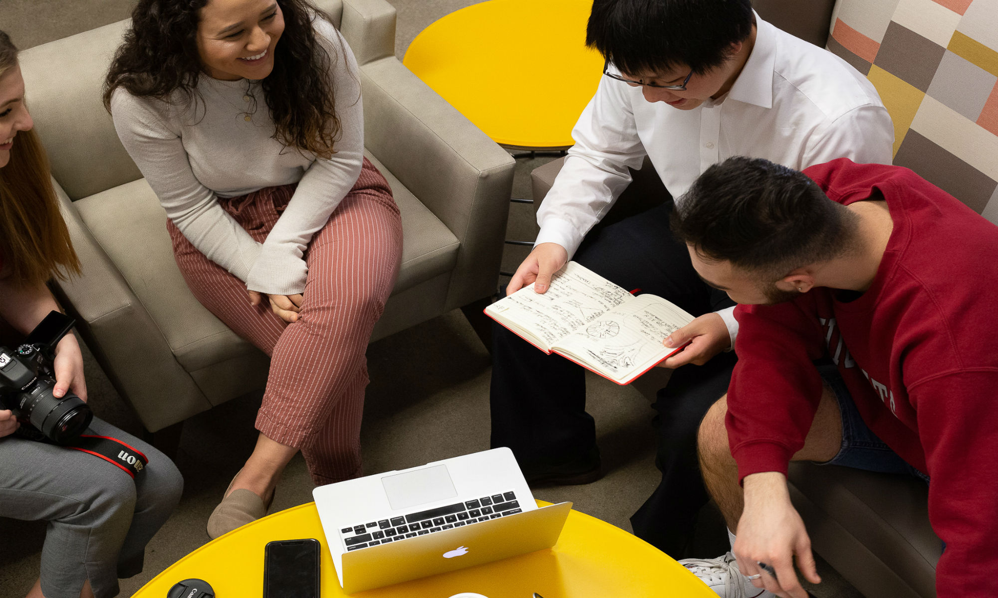
Brand management is critical and building your brand is probably the most important. All the skills you possess will get you far, but how you look and how you present yourself will definitely add on those points with employers. There are many things you’re taught to become aware of when entering the professional world. Here are three ways to really strengthen your brand.


  1. Dress for success


You want to make sure that how you dress both relate to the culture of your workplace and represent what’s important to you. Discover what your style is and get creative when relating it to your workplace culture. Some places will probably require you to dress more business professional, while others might be more casual and informal. Whatever the culture is, make sure you style yourself up so you give off the impression that you are passionate about where you work.


  1. Clean up your social media


Keeping your social media pages clean will help avoid awkward conversations from your employer. Even if your page is private, those inappropriate pictures can still make their way into the public eye. How you present yourself on social media can reflect greatly on your company. Employers will sometimes take a look at your social media pages to get a glimpse of who you are and what you represent. Therefore, make sure to only present your best self on social media.


  1. Amp up your network


What a better way of exhibiting your best self than by having a few professional individuals backing up all of your strong qualities. Having some respectable connections can truly make your brand look credible and open up more opportunities for you. However, these connections aren’t going to come to you. Branch out to other people who work in the positions or industries you want to work in to gain some knowledge of what to expect and build that relationship as well.

Among all other things, displaying your best brand requires endless effort, since it’s a lifetime job and always remember to keep it consistent. Showcasing your utmost personal brand will open many professional doors for you in the workforce.


By: Grace Gonzalez

Five Signs You’re Destined to be a Designer

Photo of teacup, sketch tablet, and candle on desk

Starting college three years ago, I had a few very different ideas for the major I wanted to declare. I knew (or thought) I wanted to either be a nutritionist, psychologist, or dentist, none of which have anything to do with the major I am currently finishing my degree in today. As an 18 year old in my first year away from home I was confused and intimidated about the idea of having to pick a major that I would be doing for the rest of my life. I knew I wanted to make money and be happy, but didn’t know exactly what that meant yet. Now, three years later I am finishing my last few classes towards my bachelors degree in Graphic Design. I’ve learned a lot about who I am and what makes me a designer at heart, and there have been a few defining moments where a lightbulb went off in my head that insisted “you should be a designer!” These realizations led me to choosing Graphic Design and realizing that the little things that make me who I am were clues to what profession fit me and would maybe even make me money someday too. The following five tips led me to not only choosing design but realizing that design was a part of me. If you can relate to these in your own life, you may very well be destined to be a Graphic Designer.


1.You’re a people pleaser

I learned while meeting new people in college that I am a people pleaser, but in a good way. I like to solve people’s problems and am constantly communicating everywhere I go. Making others happy makes me happy. As a graphic designer I have found a passion for taking someone’s vision and making it come to life through design. I love watching a client’s face come to life when I present them with a final version of their ideas.


  1. You speak the language of color

Everywhere I go, I notice color. Designers don’t only see the color blue, they see sapphire, teal, turquoise, and navy. Even the smallest difference in shades of color catch a designer’s eye. I am constantly noticing good color palettes, clashing ones, and ones I want to use on my next project.


  1. You have a packaging radar

Ever since I was old enough to go shopping I have been judging products by their packaging. I often buy things just because of uniquely designed packages. I even have a few empty bottles of wine in my kitchen that I refuse to throw away solely because I love the labels. Designers have an eye for what catches attention and sells a product, and what screams bad design. I’ve always believed that packaging is more than just wrapping a product, it’s about first impressions and getting a sneak peak to what’s inside.


  1. You’re a typography snob

From poster headings to body text in a book, typography is the character of any message. To the average person, a font is just a letter on a page, but to a designer, each font tells a story and has a voice. I remember visiting restaurants and scanning the menu, noticing an alarmingly weird typography choice while everyone else was deciding what to order. Graphic Designers know that typeface choices are vital to a design’s message and sometimes say more than the actual words on the page. If you spend a copious amount of time picking the perfect typeface, it’s a true sign you think like a graphic designer.


  1.  You don’t have a taste for sugar coating

Ever since grade school, I’ve been intrigued by feedback. I’ve always had a way of taking constructive criticism and using it to my advantage. I always ask for people’s honest opinions on everything I do. Any feedback is one step closer to the solution. As a designer, you have to have tough skin when listening to someone else’s critique about a logo you just spent ten hours perfecting. To me, I never saw sugar coated criticism as anything but a waste of time. In order to grow and evolve a design, you have to accept that there may be a draft eight or nine in your future, but if you are excited and willing to re-do and revise, you think like a graphic designer!

By: Paige Hough

Photo by Paige Hough

Building Coffee Connections: Corporate vs. Local Business

A white background with black words the say "Tender Loving

It’s hard to imagine getting through a busy weekday morning without a cup (or two) of freshly brewed coffee. Whether it’s made at home, a chain or your local cafe of choice, coffee is one of the most consumed beverages in the U.S., generating $5.18 billion annually. While this industry is booming, it hasn’t always been so successful and good public relations and marketing have had a big hand in its popularity.

When I got a job as a barista at the coffee behemoth Starbucks four years ago to support myself through college, I never imagined the impact that coffee has had on both my personal and professional lives.

Tender Loving Coffee is now my client this semester. They are a small batch specialty coffee roasting company located and served locally in Chico. It has been a huge learning experience to be able to implement my own PR strategies into both of these companies.

Starbucks didn’t become a household name solely by serving up tasty coffee and friendly service. A whole lot of PR and marketing campaigns help them stay relevant. I’ve begun to pay much closer attention to the promotional materials we are sent, the company’s social media posts and how they handle crises. (Red cup situation anyone?)

I’ve seen how the corporation takes responsibility for its actions and addresses controversy when needed. They make sure to send messages out to the company’s employees or “partners” to address major changes or problems in the company.

Tender Loving Coffee is a more intimate experience, which makes the PR pretty fun. So far, there’s been a giveaway on the TLC social channels. Winners picked up their prizes at the Saturday morning Farmer’s Market, where the company sells their coffee in a mobile coffee cart. Being so connected to TLC customers and the Chico community as a whole is a very different experience in comparison to Starbucks.

With the rise of social media, many Starbucks stores have begun to create their own social media presence through Instagram. This helps to create connections with customers and give a more intimate look and feel to your local Starbucks.

I am the closest thing my store has to an in-house PR professional. After establishing the account, I’ve helped create content on the downtown Chico Starbucks Instagram. More recently, I have been documenting the store’s remodel, upcoming specials and developing a more recognizable aesthetic.

While the idea is to connect more with other Starbucks partners and the Chico community, there is a noticeable difference in posting for Tender Loving and Starbucks — even if they are both small accounts.

That’s a no brainer though, right? A small coffee company with less than 300 followers on Instagram versus posting for Starbucks, the multi-billion dollar coffee giant.

Posting on social media for a small, local coffee company is a more interactive experience. The customers are wholeheartedly supportive of TLC. They send direct messages to check on and communicate with Anna, the brains behind the roasting.

I think the idea behind having stores run their own Instagram is to make that connection with their customers like Tender Loving Coffee already has. Through maintaining their social media, I’ve seen what works and what doesn’t for that warm, welcoming feeling Tender Loving gives off effortlessly.

Making connections with PR and coffee is about engagement, having empathy and being a part of a community. Implementing these has already made the downtown Starbucks Instagram and Tender Loving Coffee more successful and gives the companies their own personable identities.

The Creative Process

Things to keep in mind – Videography

Videography requires a lengthy process which involves a lot more than just picking up a camera and recording. It’s important to make time for the creative and collaborative process. The more time you spend working through and agreeing upon an objective, the less time it will take you to reach your goal and have a successful outcome. Take more time during this process to fully develop a clear concept.

The first thing you will realize when it comes to the creative process, is that it involves an extraordinary amount of patience. The pre-production process is a slow process. You have to carefully plan out where you’re going to shoot, who or what you’re going to shoot, the lighting, the audio, and many other things. These all take time to plan out and you might want to move more hastily but you have to remember that, “good things take time”.  It’s better to film your production with careful planning and have it be successful. As opposed to rushing it and having to go back and re-do things due to mess-ups or difficulties. It might be a slow process but  try to enjoy it and just know that it will pay off when it’s all said and done!

Sometimes, your client or boss may not exactly know what they want. During these times, you will have to step up and take charge. Many of the decisions made during pre-production, film creation, and post-production will be influenced by your vision and voice. Don’t be afraid to speak up if you have an idea that you believe will better capture the image or deliver the message. However, you need to remember that you are trying to create their vision. So be respectful and try your best to guide them through your creative process so that you can work well together. It’s important to balance your process with what the client needs. Keep your goals in mind but also make sure that you reach your client’s goals as well.

Be confident! Get over your fear of being judged or being wrong. We all start being creative from a young age and often times, others tend to discourage us. You’ve experienced this during your time in school and even out of school. You won’t always be able to get everyone to like your idea or to agree with you. However, it’s important to be confident in yourself and your work. Confidence and a positive attitude can go a long way.

Just remember to work hard and have fun! You have the power to create a piece that not only meets your client’s needs, but that also satisfy yours.

Written by; Braulio Martin

Avoid Typographic Disaster – A Guide to Use Typography And Organize Presentations


As we all probably know now, the 2017 Academy Awards had the biggest screw-up in its 88-year history. When Warren Beatty and Faye Dunaway announced the nominee for the wrong category of award, they were just as confused as we were. They were given the Best Actress envelope when they were supposed to announce for the Best Picture. What is the cause of this disaster? ­

Typography.

On the nominating card, very small fonts are used on the award name and large bolded fonts are used on the nominee’s name. Warren could not read the it and a typographic disaster is created.

Typography is a study in process of making typefaces. Typeface is often called “font,” but this is a common misconception. A typeface is a series of fonts that make a font family. Font is just one character style that belongs to a typeface. Within the typeface, there are fonts with various weights and styles. Understanding what typeface, you are using and how to use them can enhance the attractiveness of your presentation.

I will guide you through what I have found about using typefaces in a presentation.


  1. Legibility

Legibility means being clear enough to read. It is an important aspect in using typography. This is most likely the first thing that you learned when you just start to write in elementary school. All alphabets have its specific written style. If we use a typeface that has too much decorative parts in a presentation (like a script typeface), it might create reading problems for your audience. Avoiding script and decorative typefaces can make your presentation look clean and easy to read for your audience.


  1. Using matching typefaces

Typefaces are designed to be used in various places, like paper documents, websites and presentations, but different typefaces can also work together to make your message clear in a presentation. A serif typeface like Times New Roman is normally good for smaller text but it would not work well for a title or heading because its long serif can be distractive. San serif typefaces like Helvetica are great for large texts but would look boring for smaller text. Sometimes you can mix and match serif and san serif typeface in one slide of a presentation.


  1. Focusing on function rather than form

When it comes to what typeface to choose, we often try to choose more complicated typefaces with unique forms. It might be interesting for a slide but most of time it only makes your audience more confused. A better way to find what typeface to use is to understand your content. For example, if you are doing a slide related to history, serif typeface can fit to the theme very well.  Try not to use typefaces that have complicated visual effects. If you really want visual effect, take a consideration of the legibility of that typeface.


  1. Over emphasizing

Sometimes we tend to emphasize too much on one point of a slideshow. Instead of a short phrase, people tend to write a crowded paragraph, which reduces readability of a slide. It causes people to squint their eyes and lose focus on the speaker. It doesn’t mean we shouldn’t emphasize anything. Sometimes certain content requires different level of emphasis.


  1. Creating hierarchy

Spending time on prioritize what is important content can help you categorize your points. Then lay out what is most important from secondary important. This also helps us to figure out how many words you will have on your slide. The goal is to eliminate unnecessary words and make the presentation cleaner.

At the end of the day, your presentation has to be simple and clear. The purpose of having a demonstrative piece is to help others to understand and organize knowledge. If a slideshow confuses people, it will defeat the purpose of having a slide show altogether. 2017 Academy Awards could be a lot more successful if the card designer of the event care about typography and organization in any form of visual communication.

Tattoos In The Workplace

Tattoos or “taboos,” depending how you view them, have always been a hot topic of conversation when it comes to the workplace. Questions of their professionalism and whether they belong in the workplace are constantly circling.

I think tattoos are beneficial to the workplace for these reasons:

  •     Tackle social norms and challenge the changing industry of public relations.
  •      Address a social change that is congruent with the shift in generations.
  •      Teach people to not judge a person by their appearance.
  •      Teases people to ask questions and engage with their coworkers.
  •     Offer another perspective.
  •     Open a door to imagination and interpretation from others
  •      Shows creativity and expression.

Shaming the presence of tattoos in the workplace stifles the creativity and expression of employees in an industry that needs those qualities.

Now more than ever, public relations firms need inventive individuals in order to make an impact in the growing industry. I think ownership of tattoos demonstrates  risk taking ability, and that can translate to a positive work environment.

I have two tattoos, one of which rests on my left forearm just below my elbow bone. It consists of three evenly spaced, black lines that represent my two siblings and me. All three of us got the tattoo together but in different regions of our bodies, and mine got the most flack from our parents because my location is the most prominent of the three.

Prior to getting this tattoo, my parents felt the need to reinforce the idea of damaging my future chances at getting a job. I was conscious of the severity of my decision and that I could potentially be limiting myself of future jobs but I decided that I would never want to work for a company that stumps creativity in the workplace by not allowing tattoos. I also figured that most professional attire would cover my tattoos, but there was still risk involved.

Just like most anything else, there is a time and a place for tattoos as well. At the end of the day, companies have to protect the workplace, so not all tattoos may be acceptable depending on whether they contain vulgar or offensive content. But more importantly than vulgar tattoos, I think tattoos should be covered when meeting with a new client for the first time. With varying opinions on tattoos it is always best to err on the side of caution when you are trying to make a great first impression. No one wants to damage a relationship or lose a client because of something that could have easily been avoided.

As a send off tip, I think a good rule of thumb to follow is the saying, “In the streets dress your best but at work be comfy at your desk.” Simply, just cover up your tattoos if you could be client facing.